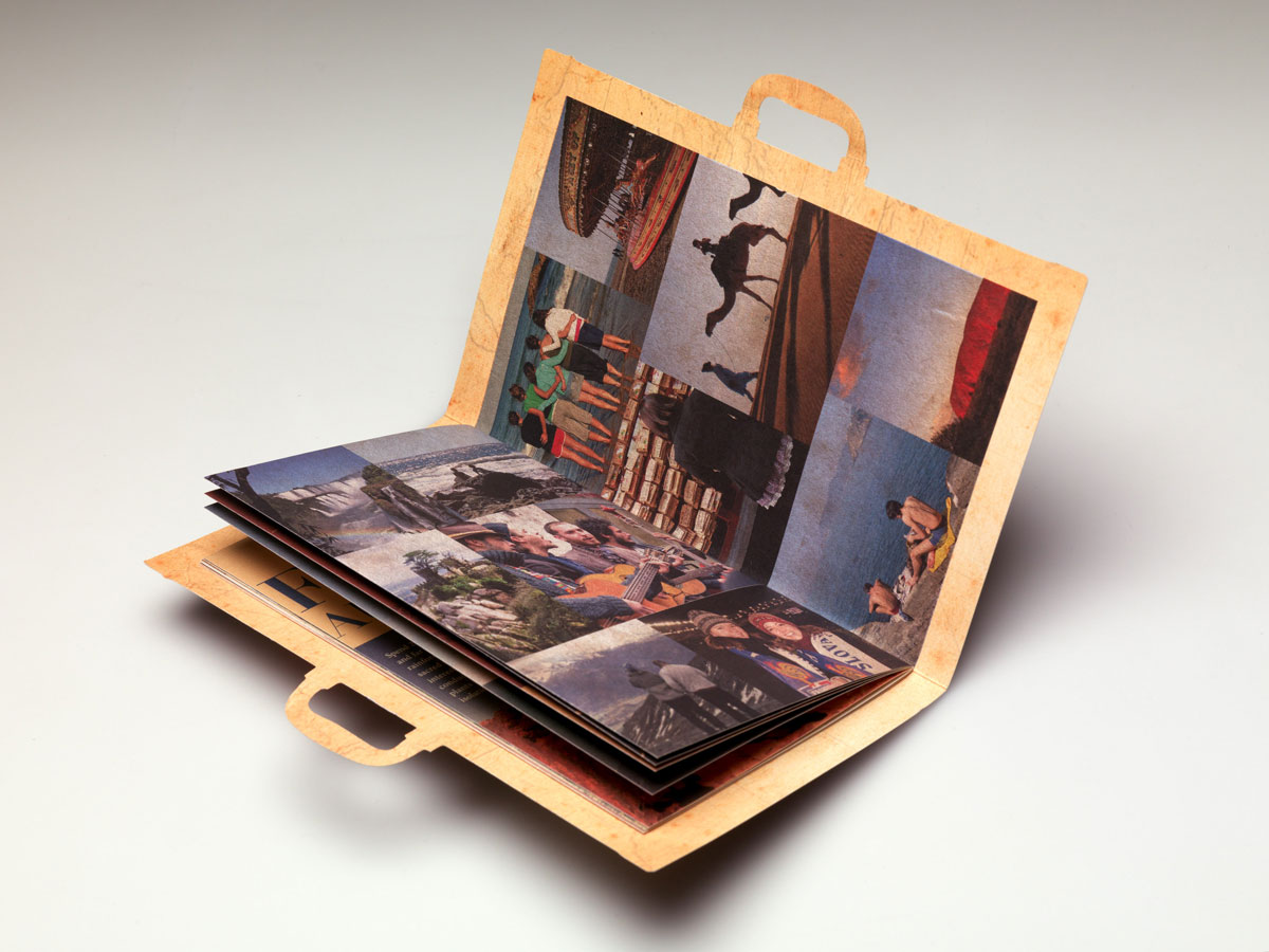
Susquehanna University Travel Collateral
January 21, 2021

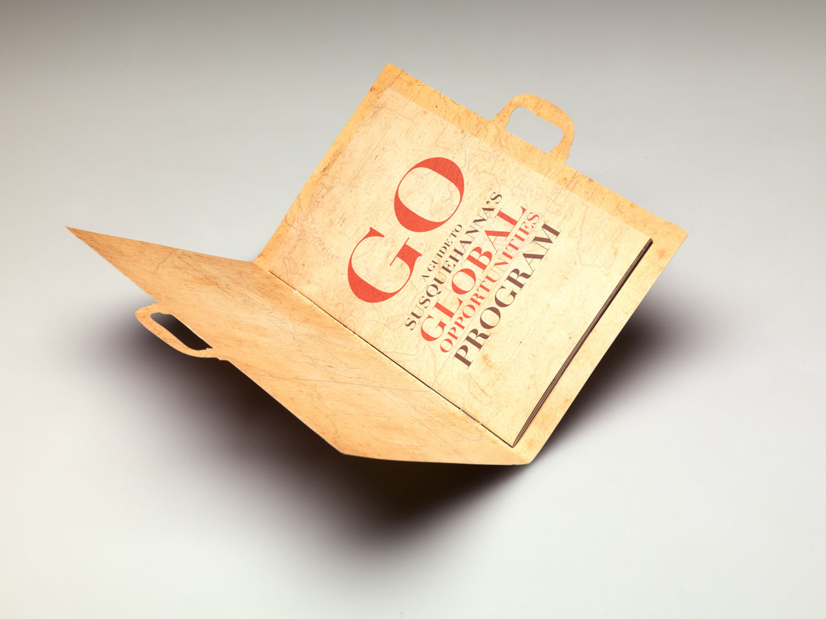
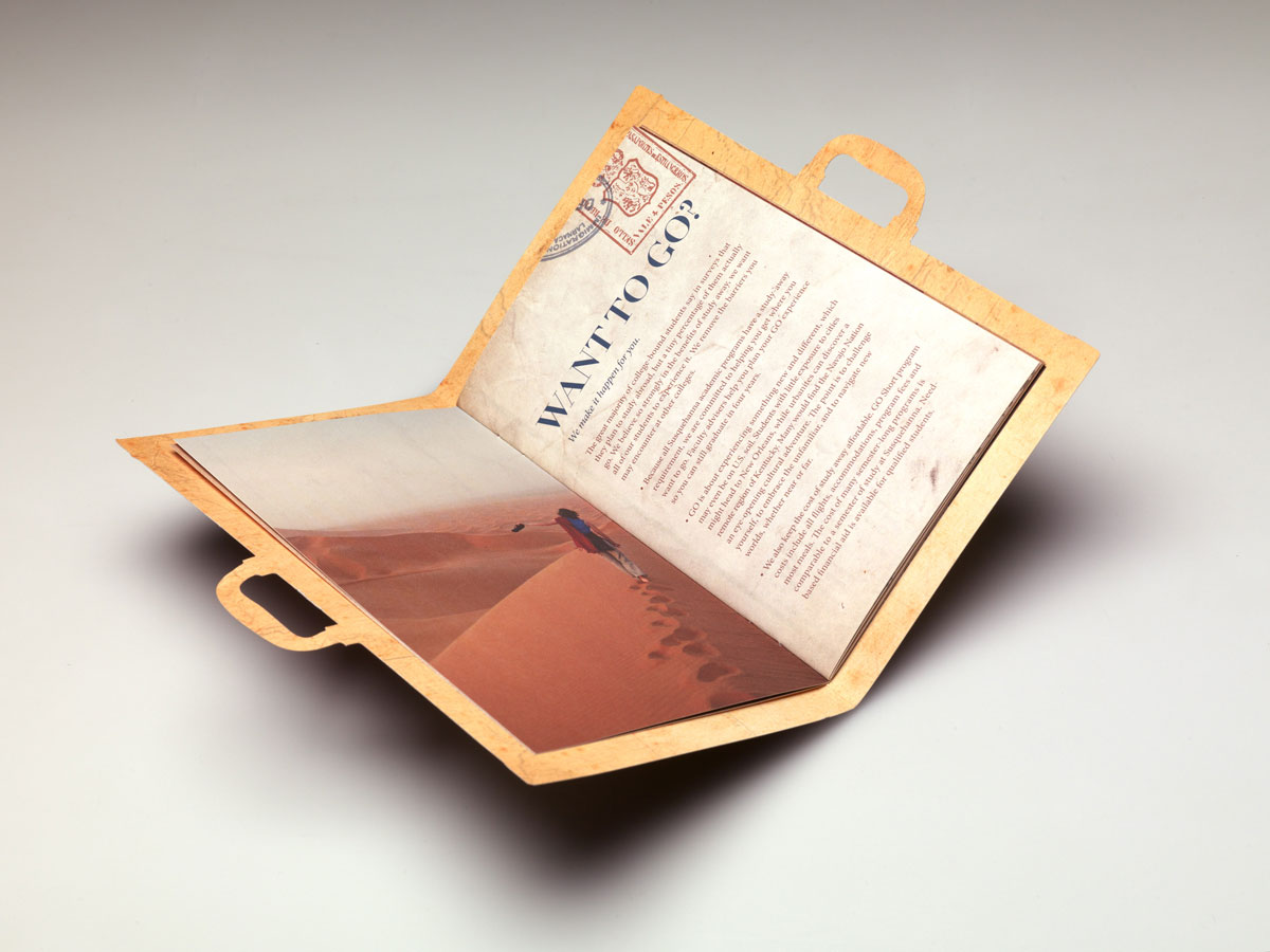
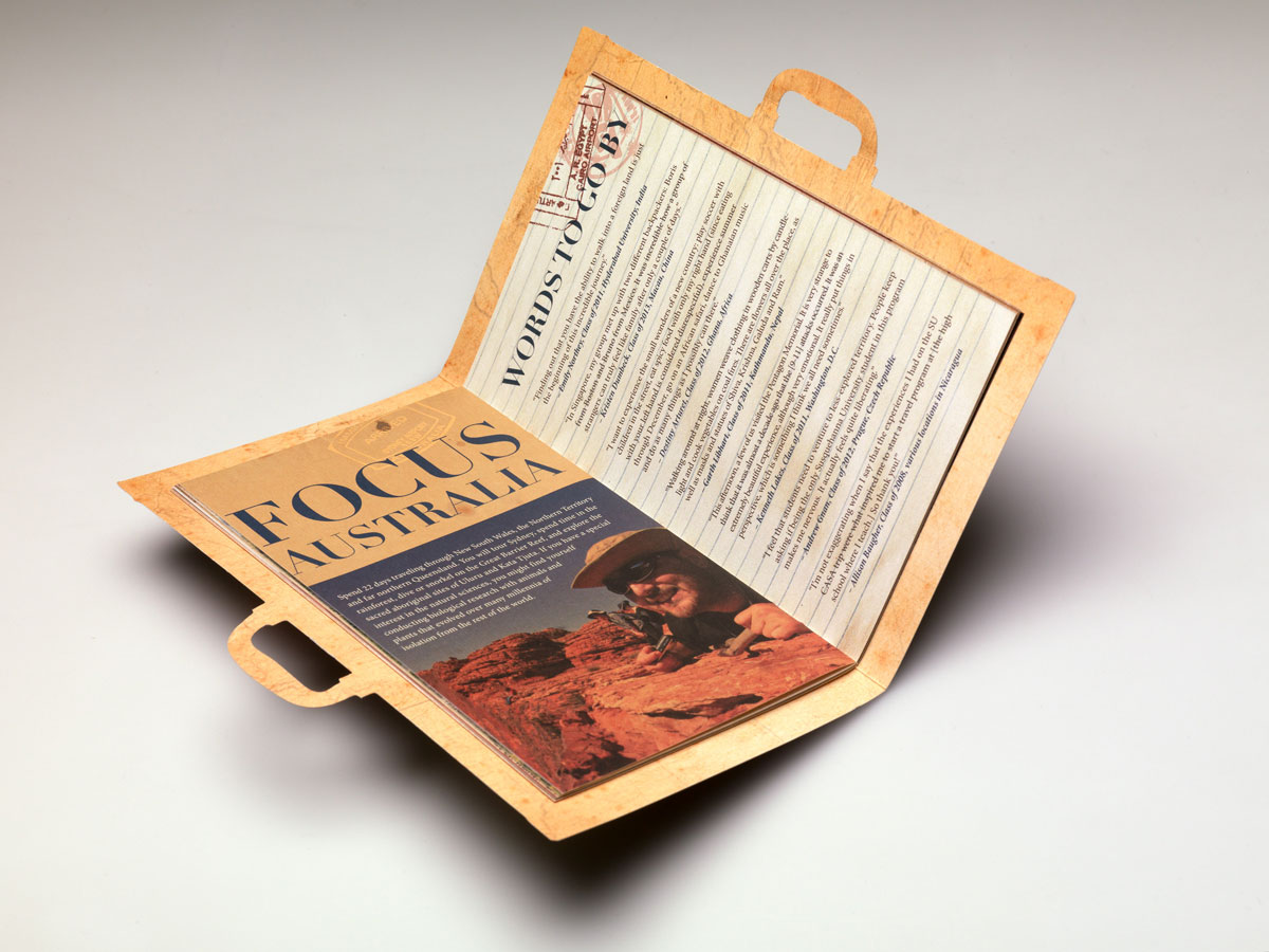
Susquehanna’s graphic design department created a memorable and effective way to recruit students for their travel program. The informational brochure was sent after prospective students responded to the die-cut and uniquely bound “suitcase” teaser. The Suitcase image was die-cut to the handle, and the text is made of short pages making it look a bit like a passport. Brass (instead of traditional silver) wire was used for the stitching – blending in nicely with the color. The entire package represents Susquehanna well, and begs the recipient to pick it up and read through it. Simple die-cutting, a little extra effort on the binding, and great graphic design go a long way to producing desired results.
